ggplot(data = my_data, mapping = aes(x = var1, y = var2)) +
geom_line()Data Visualization
Sections 2.4 - 2.6
5NG#3: Histograms
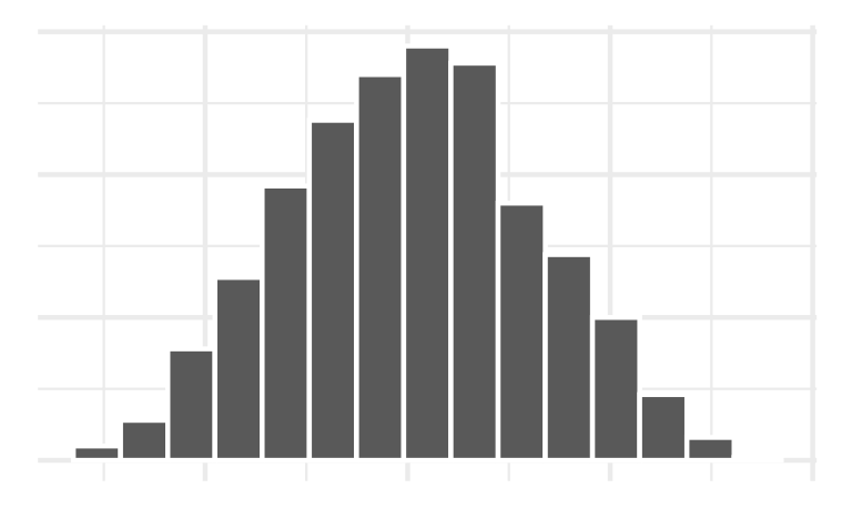


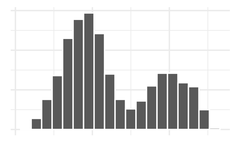
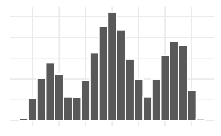
Example 1: Histogram bins
Which bin size is most appropriate and describe the distribution of penguin body mass.
![]()
ggplot(penguins, aes(x = body_mass_g)) +
    geom_histogram(color = "white",
                   fill = "lightblue",
                   bins = 7)+
    labs(title = "Palmer Penguins Distribution of Body Mass",
           x = "Body Mass (g)")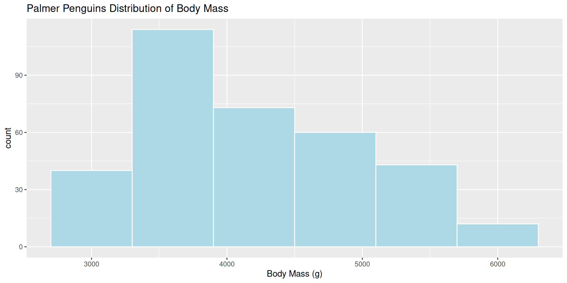
ggplot(penguins, aes(x = body_mass_g)) +
    geom_histogram(color = "white",
                   fill = "lightblue",
                   bins = 18)+
    labs(title = "Palmer Penguins Distribution of Body Mass",
           x = "Body Mass (g)")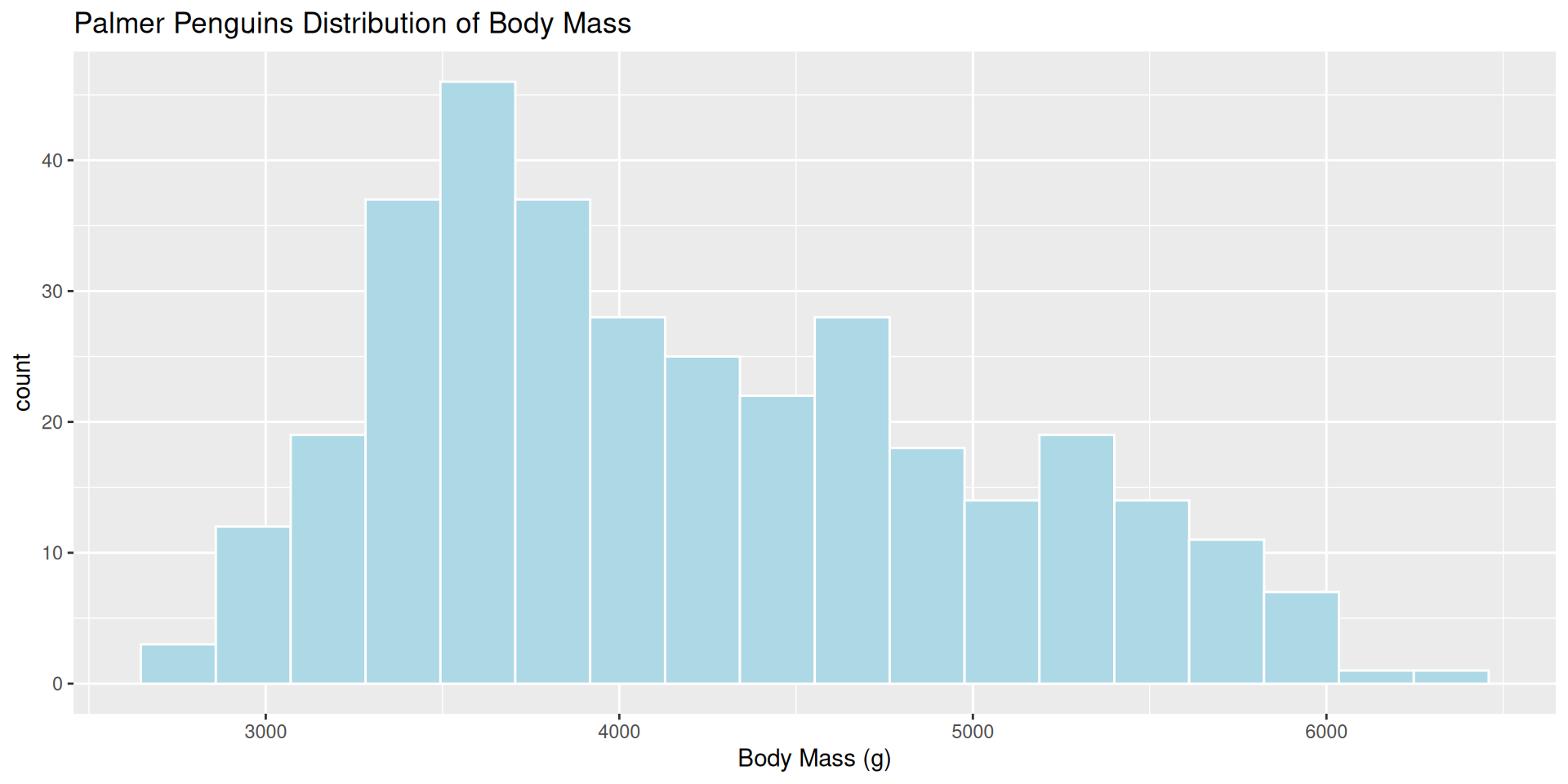
ggplot(penguins, aes(x = body_mass_g)) +
    geom_histogram(color = "white",
                   fill = "lightblue",
                   bins = 29)+
    labs(title = "Palmer Penguins Distribution of Body Mass",
           x = "Body Mass (g)")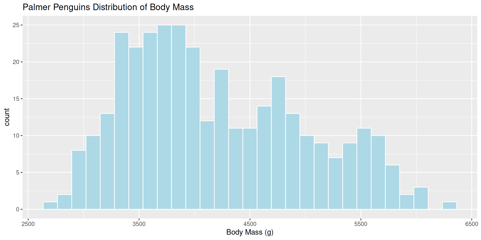
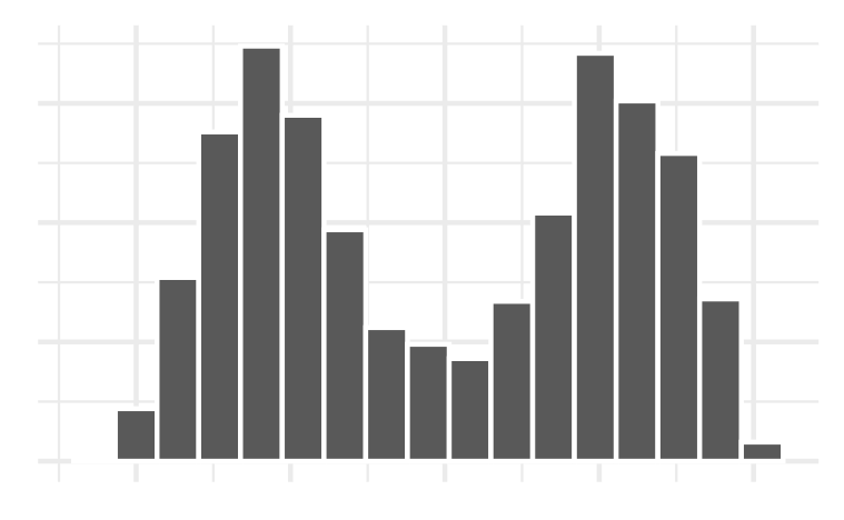
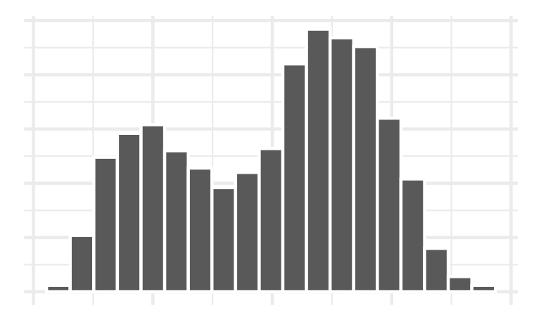
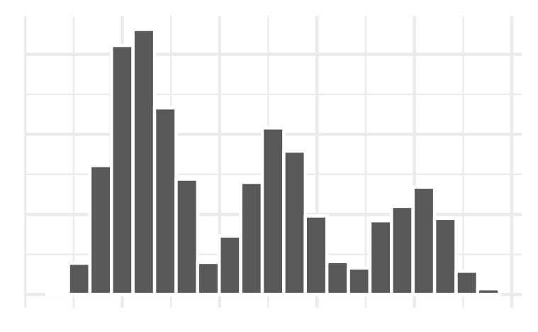
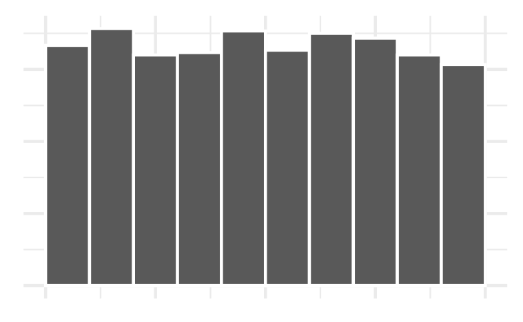
Example 2: Histogram bins
Which bin size is most appropriate and describe the distribution of penguin flipper length.
  ggplot(penguins, aes(x = flipper_length_mm )) +
    geom_histogram(color = "white",
                   fill = "tomato1",
                   bins = 15)+
    labs(title = "Palmer Penguins Distribution of Flipper Length",
           x = "Flipper Length (mm)")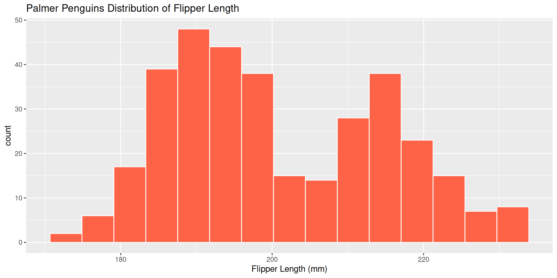
  ggplot(penguins, aes(x = flipper_length_mm )) +
    geom_histogram(color = "white",
                   fill = "tomato1",
                   bins = 25)+
    labs(title = "Palmer Penguins Distribution of Flipper Length",
           x = "Flipper Length (mm)")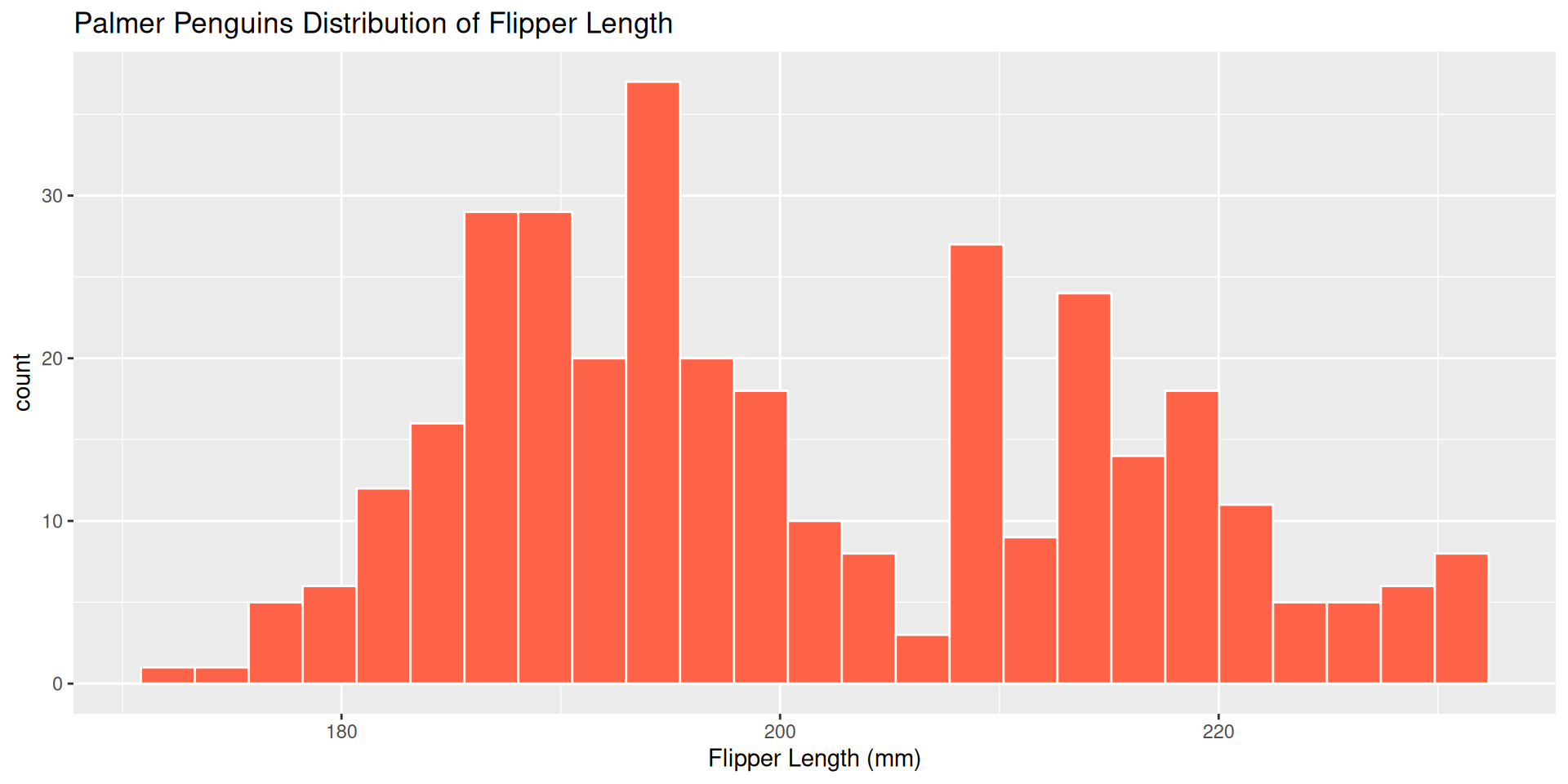
  ggplot(penguins, aes(x = flipper_length_mm )) +
    geom_histogram(color = "white",
                   fill = "tomato1",
                   bins = 35)+
    labs(title = "Palmer Penguins Distribution of Flipper Length",
           x = "Flipper Length (mm)")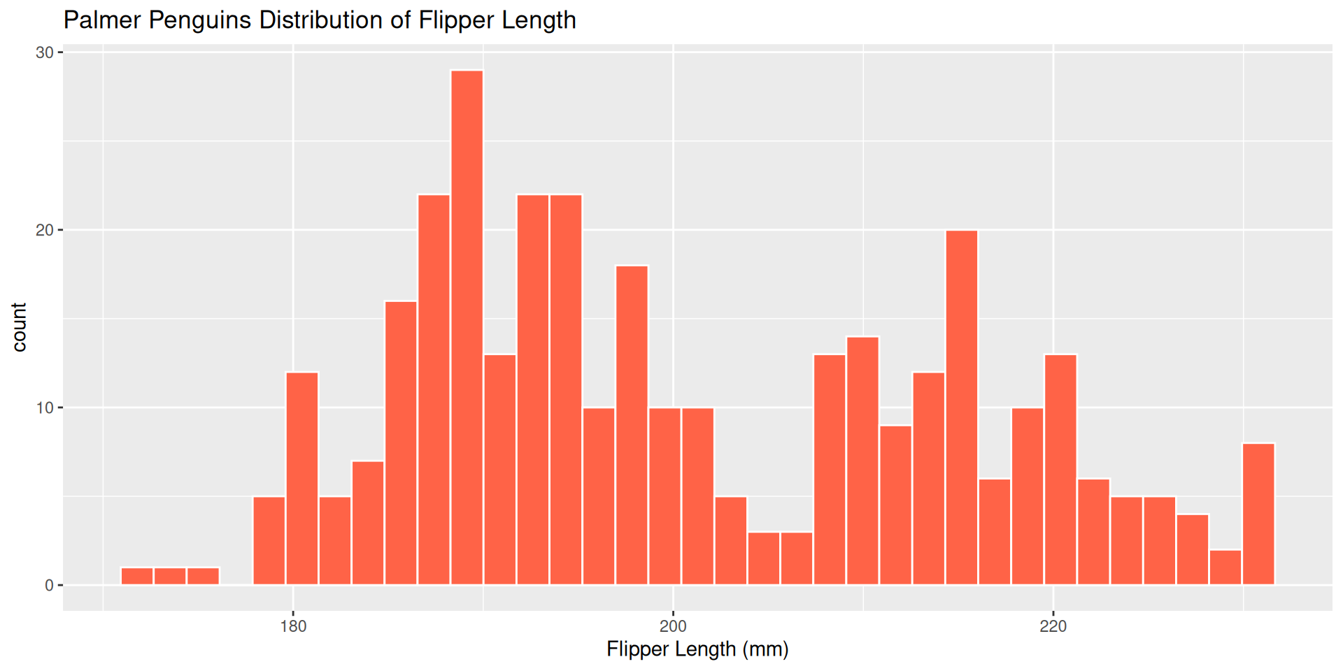
Faceting
Faceting is used to make the same plot for different subgroups of the dataset.
This is useful for comparing the same variable across different subgroups in the dataset.
facet_wrap(~var)can be added on to ANY plot type (scatterplot, linegraph, histogram, boxplot, barplot)
ggplot(penguins, aes(x = flipper_length_mm)) +
    geom_histogram(color = "white", fill = "tomato1", bins = 11) +
    facet_wrap(~ species)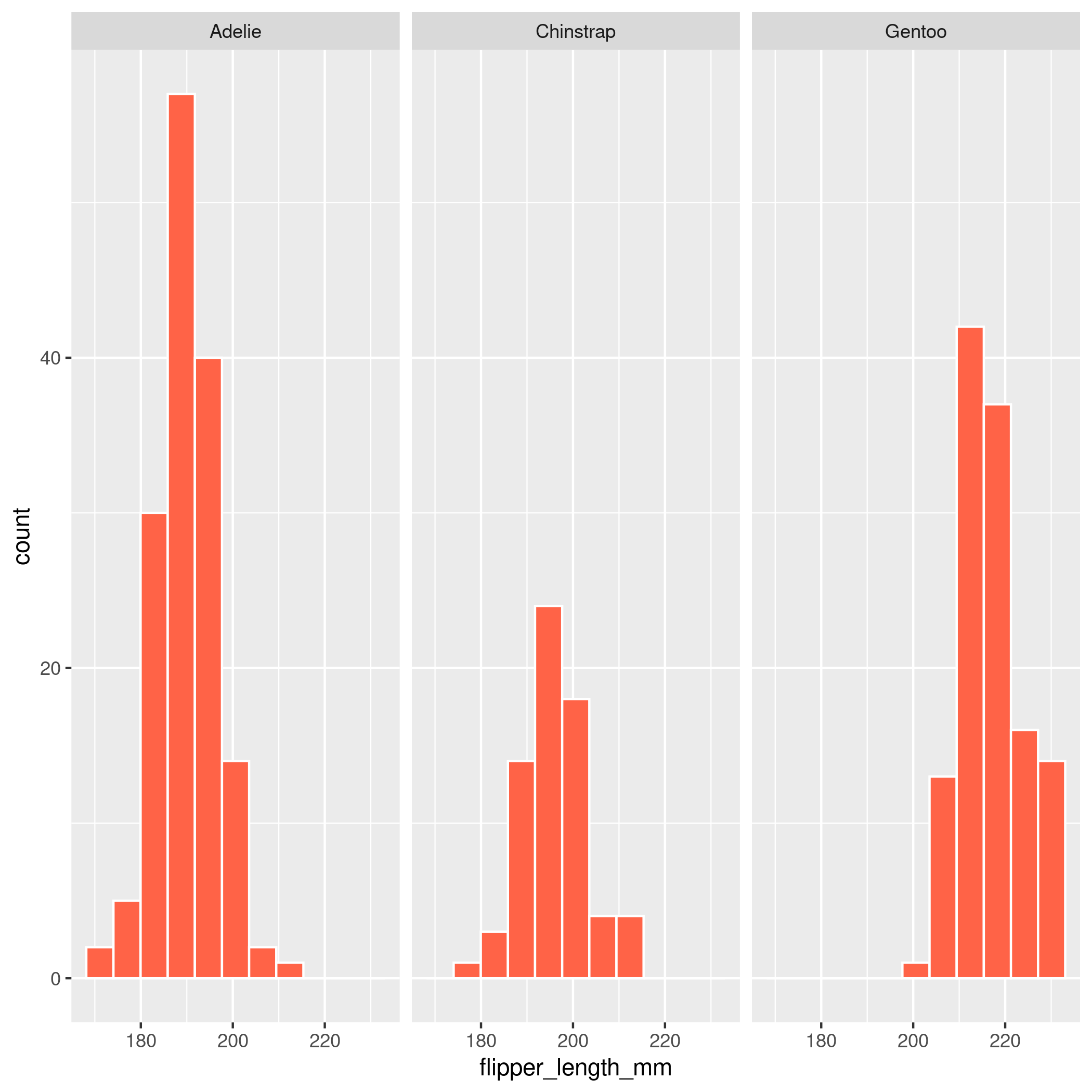
Common Coding Errors
![]()
Which of the following are correct?
a) ggplot(penguins, aes(x = flipper_length_mm)) +
geom_histogram(aes(color = "white"))b) ggplot(penguins, aes(x = flipper_length_mm)) +
geom_histogram(color = "white")c) ggplot(penguins) +
geom_histogram(x = flipper_length_mm, color = "white")d) ggplot(penguins) +
geom_histogram(aes(x = flipper_length_mm) , color = "white")